Scoreo Version 2.0.1
This update includes a bunch of fixes and cleanup from the big rebuild in 2.0. The score table layout has been reorganized and is working much better now on all platforms. Most notably, it now extends all the way to the bottom of the view so you can scroll horizontally from anywhere. The table also does a much better job of rendering names with a nice gentle fade, and makes it easier to open a player to edit it.
Second, all models on macOS now present as custom-built NSWindows in either a modal context or as panes. This really fixes a ton of problems showing the various modals like graphs, about, and new game. New game also now attaches to the main window which makes it feel much more connected and natural. I think there's more improvements that could still be made, but it's all much easier to use and develop with now.
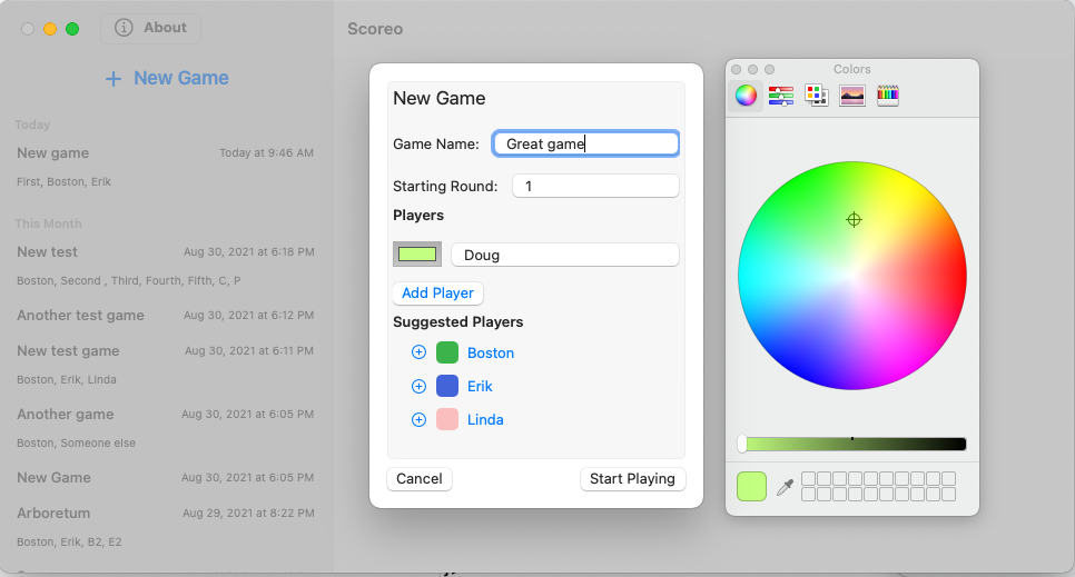
Finally, I redid quite a bit of how the new game page was done for macOS. I was really unhappy with how the iOS version of the new game page translated onto the mac. With a bit of reorganization and some small tweaks, it now feels much more mac-like, and it works better too.

I'm excited to see how people use it!
Tagged with: